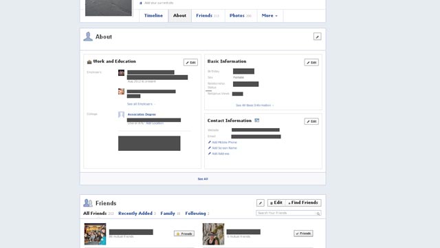
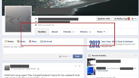
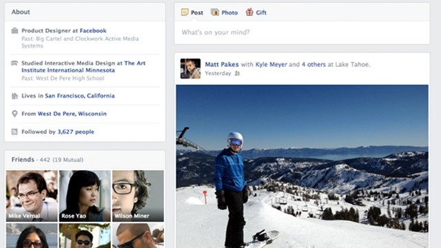
Facebook‘s redesigned timeline and news feed facebook has announced it will be rolling out improvements to timeline in a bid to make it easier for users to express what they find important to them. Users can now see their latest posts on the right side of the timeline, while photos, music, and other activities on the left panel.
We heard from you that the current timeline layout is sometimes hard to read. Starting today, all posts are on the right side of your timeline, with photos, music and other recent activity on the left,” says facebook about the new layout. Users can now and other apps to share more things on the site. for an example, users can include instagram photo stream as a section on their timeline. Users can remove the app from their about page, using the activity log.
Facebook’s new news feed design is aimed at preventing user fatigue, and also attracting new advertisers to the network. The focus is minimalism in design, and greater visibility for shared media – photos and videos. The new design is being rolled out for the desktop version, as well as the mobile version. The company wants a uniform look of the network, no matter what the device or the platform.
The news feed, which pro-vidoes a running list of updates from a user’s network, will serve as “personalized newspaper” for Facebook’s i billion users, chief executive mark zucker berg said. He mentioned that this is another step in the “evolving face” of the social network. He said that he wants facebook to be “the best personalized newspaper in the world.”


